portfolio
Responsive & Mobile Web Development
Project Management,Back-end Development,Responsive & Mobile Web Development
Responsive & Mobile Web Development,Cross-platform app development
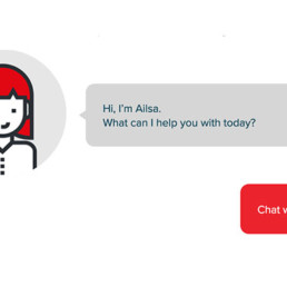
Back-end Development,Chatbot Development
Back-end Development,Responsive & Mobile Web Development
Back-end Development,Cross-platform app development